Choosing the right Photo Printing Paper can transform an ordinary image into a convincing physical print. A bright landscape may need a glossy surface, while a family portrait often feels softer on satin paper. The choice affects color depth, texture, viewing angle, drying time, and long-term durability. It is not simply a matter of choosing the most expensive pack.
In practice, paper selection should match the printer, ink system, and intended display location. Check the paper manufacturer’s specifications before printing. Look for compatible weight, surface finish, brightness, and recommended printer settings. ICC profiles can improve color accuracy, especially for professional work. A matte fine-art sheet may reveal subtle shadows beautifully, but it can appear less vivid under dim lighting. Glossy paper produces stronger contrast, though fingerprints and reflections may become distracting. Small details matter.
I once printed the same photograph on three surfaces and judged the results too quickly. The glossy sample looked impressive at first, but window reflections weakened it later. The matte version seemed dull, yet its skin tones felt more natural beside warm indoor lighting. That experience changed my testing process. I now compare small proof prints, inspect them under realistic light, and allow enough drying time before judging color. Paper claims are useful, but personal testing remains necessary. Even experienced photographers can overlook how room lighting changes the final impression. This guide will examine paper types, finishes, weights, printer compatibility, and archival considerations, helping you choose with evidence rather than assumptions. There is no perfect paper. There is only the best match for your image, equipment, budget, and purpose.
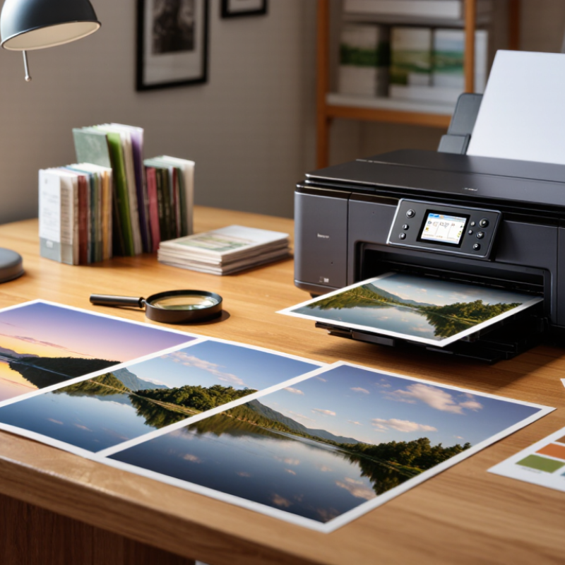
Photo paper differs in surface, coating, and base, and each choice changes the image’s appearance. Glossy paper gives colors a bright, saturated look and deep contrast. It can suit vivid landscapes or portraits with strong color. However, ceiling lights may create glare, and fingerprints show easily. Not ideal for every room.
Luster and satin papers have a softer sheen. Their fine texture reduces reflections while preserving much of glossy paper’s color depth. They are often a practical choice for framed prints or photographs handled occasionally. Matte paper has little reflection and a more subdued finish. It can work well for black-and-white images, soft tones, or prints viewed under bright lights, though dark areas may appear less rich.
The paper base matters too. Resin-coated sheets tend to dry quickly and resist moisture, while fiber-based papers can offer a more tactile, traditional feel. Check the printer’s supported paper type and thickness, then select the matching media setting; the wrong setting can affect ink coverage and drying. Small tests help. Print the same crop on two finishes and compare it under the light where it will be displayed. A paper that looks beautiful on a screen may feel too glossy in a sunny hallway. I still find that choosing by finish alone can be misleading.
Glossy paper creates bright colors, strong contrast, and crisp details. Luster and satin reduce glare while preserving color depth. Matte paper has minimal reflection and a softer appearance.
Choose glossy paper for vivid landscapes, colorful portraits, and images needing strong visual impact. It can make details pop. Ceiling lights may create distracting glare.
Matte paper suits soft portraits, black-and-white images, and prints displayed under bright lights. It reduces reflections. However, deep shadows may look less rich.
These finishes offer a middle ground between glossy and matte. They reduce fingerprints and reflections while keeping much color depth. They work well for framed prints and family albums.
Resin-coated paper dries quickly and resists light moisture. Fiber-based paper feels more traditional and tactile. The surface matters too.
Print the same small crop on two finishes. Compare them beside a window and under normal room lighting. Check skin tones, shadows, and glare.
No. Light, humidity, ink, storage, and surface coatings also affect durability. Thick paper can still fade or scuff. I sometimes judge thickness too quickly.
Compare the cost per usable print, not only the sheet price. Cheaper paper may waste ink or produce dull shadows. Test dark areas before buying a large pack.
Not really. Recycled fibers may reduce virgin pulp use, but coatings can complicate recycling. Check local recycling rules and consider packaging waste. There is no perfect option.
Choosing the best Photo Printing Paper begins with understanding how different paper types affect color, detail, and overall appearance. A glossy finish can make colors look vivid and bold, while matte paper offers a softer look with less glare. Luster and satin finishes provide a balance, making them useful for a wide range of images. Consider the mood, viewing conditions, and intended use of each photo when selecting a finish.
Paper weight, brightness, and color tone also influence the final result, so choose them to suit the image and desired feel. Check that the paper works with your printer and ink, since compatibility can affect color accuracy, drying, and print quality. Finally, compare durability and cost, and consider the environmental impact of the paper. A thoughtful choice balances appearance, performance, longevity, and budget.

 Jingkuo